A Hovmöller diagram
A Hovmöller plot collapses one space dimension and keeps time, which makes it the natural next step once zonal means work. It is also where picking the right corner of the pyramid stops being an optimisation and starts being the difference between a figure and a coffee break.
Pick the frequency before the level
The hub is a pyramid in time as well as in space. The same ERA5 data is published hourly, daily and monthly, and this figure has about five hundred pixels along its time axis covering four decades. Monthly is already finer than the plot can show.
Reading the hourly store and averaging it down would move seven hundred times the bytes to draw exactly the same picture.
import matplotlib.dates as mdates
import matplotlib.pyplot as plt
import numpy as np
import xarray as xr

URL = "s3://reanalysis/healpix/era5/P1M/level_4.zarr"
S3 = {"anon": True, "endpoint_url": "https://s3.waterpark.dkrz.de"}

ds = xr.open_zarr(URL, storage_options=S3, chunks=None)
level = ds.attrs["healpix_level"]

field = ds["tas"].sel(time=slice("1980", "2024"))
print(f"{field.sizes['time']} months x {field.sizes['cell']} cells, "
      f"{field.nbytes / 1e6:.0f} MB")
Level 4 for the same reason: a zonal mean has no longitudinal detail left in it, and 63 rings is already more than the figure resolves vertically. The level in the URL and the frequency in the URL are two independent knobs, and both should be turned down to whatever the question actually needs.
Zonal means, by ring
latitude = ds["latitude"].values
_, rings = np.unique(np.round(latitude, 8), return_inverse=True)

hov = field.assign_coords(ring=("cell", rings)).groupby("ring").mean().load()
ring_lat = np.array([latitude[rings == r][0] for r in range(rings.max() + 1)])

print(f"{hov.sizes['time']} months x {hov.sizes['ring']} rings")
The rings are not evenly spaced
This matters here in a way it did not in the line plot. Plotting against the ring index would stretch the poles and squash the tropics, because HEALPix spaces its rings so that every cell has the same area, which in the equatorial belt means evenly in the sine of latitude rather than in latitude itself.
So give pcolormesh real latitude edges. Midpoints between neighbouring
rings are close enough for a figure and honest about what they are.
lat_edges = np.concatenate([
    [-90.0], 0.5 * (ring_lat[1:] + ring_lat[:-1]), [90.0],
])

# `shading="flat"` wants edges on both axes, so the time axis needs one more
# entry than there are months: the closing edge of the last one.
times = hov["time"].values
time_edges = np.append(times, times[-1] + (times[-1] - times[-2]))

spacing = np.diff(ring_lat)
print(f"ring spacing: {spacing.min():.2f} deg at the equator, "
      f"{spacing.max():.2f} deg near the pole")
The plot
Two panels: the field itself, which is dominated by the seasonal cycle, and the same field with each month's 1980-2009 climatology removed, which is where anything else lives.
climatology = hov.sel(time=slice("1980", "2009")).groupby("time.month").mean()
anomaly = hov.groupby("time.month") - climatology

fig, (ax_raw, ax_anom) = plt.subplots(2, 1, figsize=(11, 8), sharex=True)

mesh = ax_raw.pcolormesh(time_edges, lat_edges,
                         hov.transpose("ring", "time").values,
                         cmap="RdYlBu_r", shading="flat")
ax_raw.set_ylabel("latitude [deg]")
ax_raw.set_yticks(np.arange(-90, 91, 30))
ax_raw.set_title(f"ERA5 zonal mean tas, level {level}")
fig.colorbar(mesh, ax=ax_raw, pad=0.02, label="K")

span = float(np.nanpercentile(np.abs(anomaly.values), 99))
mesh = ax_anom.pcolormesh(time_edges, lat_edges,
                          anomaly.transpose("ring", "time").values,
                          cmap="RdBu_r", vmin=-span, vmax=span, shading="flat")
ax_anom.set_ylabel("latitude [deg]")
ax_anom.set_yticks(np.arange(-90, 91, 30))
ax_anom.set_title("anomaly from the 1980-2009 monthly climatology")
ax_anom.xaxis.set_major_formatter(mdates.DateFormatter("%Y"))
fig.colorbar(mesh, ax=ax_anom, pad=0.02, label="K")

fig.tight_layout()
fig.savefig("06_hovmoeller.png", dpi=110, bbox_inches="tight", facecolor="white")
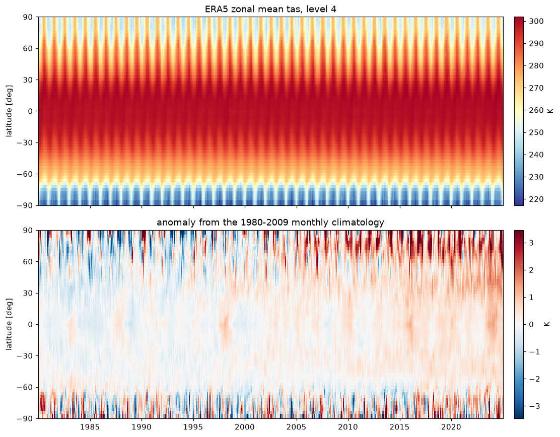
A Hovmöller diagram
What to read off it
The top panel is the seasonal cycle: large and antisymmetric in the extratropics, small in the tropics, and larger in the northern hemisphere than the southern one, which is the land-ocean contrast showing up as thermal inertia. None of that is new, and that is the point. It is a check that the pipeline is telling the truth before you point it at something you do not already know the answer to.
The bottom panel is where the seasonal cycle has been taken out, and the warming is visible as the red shifting rightwards, strongest at the northern high latitudes. Whether you call that Arctic amplification or an artefact of the reanalysis' changing observing system over four decades is a question this figure cannot answer, and a good reason to be careful with trends drawn from it.
Swapping ring for a longitude bin from the
meridional mean gives the tropical Hovmöller that
convection people actually want, with the same twenty lines.
Run it yourself: examples/06_hovmoeller.py